If the ability to convey complex information in an easily digestible manner is the goal, then accessible data visualization strategies are absolutely essential. Data visualization is the practice of graphically representing data. As the amount of available data grows, so too does the need for innovative tools and techniques to present it effectively. There are a wide variety of choices available, and you can discover the top data visualization tools with a quick search online.
The Static Visual Era
Before the rise of digital tools, data visualization was static. Charts, graphs, and infographics were meticulously crafted, often by hand, to depict data on paper. These static visuals served a vital purpose – they made complex data sets comprehensible at a glance.
They took various forms, from pie charts and bar graphs to more complex scatter plots. These methods, while not interactive, were pivotal in making data accessible to a wider audience, setting the foundation for the dynamic tools we have today.
The Advent of Interactive Visualizations
Technology evolved, and so did data and information visualization. Today, some of the best data analytics programs online boast powerful capabilities that would be unthinkable merely a few years ago. Users could now interact with the data, drilling down into specific sections, filtering results, or even playing with variables in real-time.
This interaction allowed for a more personalized understanding of data sets, catering to individual needs and queries. Not just for businesses, these tools became instrumental for journalists, researchers, and educators, transforming the way data was consumed and understood.
Marketing Data Visualization: Turning Insights into Action
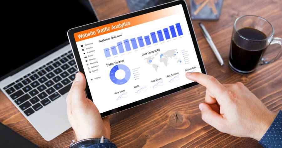
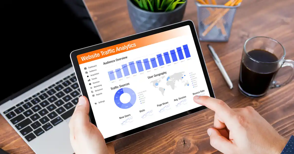
Marketing, with its diverse array of metrics and KPIs, greatly benefits from effective data visualization. With the surge in digital marketing strategies, there’s more data available than ever before. From website traffic and social media engagement to conversion rates and customer retention metrics, marketers are inundated with information.
Properly visualizing this data not only makes it more comprehensible but also enables marketers to make informed decisions swiftly. By offering a visual representation, these tools allow marketing teams to:
- Identify trends: Visualizations can quickly highlight patterns over time, such as the growth of a particular social media platform or the effectiveness of a specific campaign.
- Understand customer behavior: Heatmaps, for instance, can show where website visitors spend the most time, helping marketers optimize their site design and content placement.
- Measure ROI: With many marketing efforts, especially in the digital realm, it’s crucial to understand the return on investment. Visualization tools can easily depict which strategies are yielding results and which ones might need reevaluation.
- Optimize ad spending: Ad platforms come with a wealth of data. Visualizing this data can help marketers understand where their ad budget is best spent and where adjustments are necessary.
- Segment and target audiences: Advanced visualization tools can assist marketers in segmenting their audience, helping them tailor campaigns to specific demographics or behaviors.
Personalized Data Dashboards
Personalization is the new norm in many digital experiences, and data visualization is no exception. Data dashboards, once a one-size-fits-all solution, are now becoming tailor-made.
Users can customize these dashboards based on their requirements, allowing for a more focused view of the data relevant to them. This personal touch enhances user engagement, making the data consumption process more intuitive and streamlined.
Real-time Data Visualization
In a world that never slows down, data generated in real-time can provide valuable insights. From stock market fluctuations to social media trends, being able to visualize data as it happens is becoming increasingly essential. Real-time data visualization tools allow for immediate decision-making, giving businesses and individuals an edge in staying ahead of the curve.
Storytelling through Data
Narratives have always been a potent medium for communication. Today, data visualization experts are leveraging the power of storytelling to make their data presentations more compelling.
By weaving a story around data, they’re not just presenting cold, hard facts but are providing context, evoking emotions, and ensuring that the message resonates more deeply with the audience.
top data visualization software
Learn More Today!
Data visualization is not merely about presenting numbers in a graphical format. It’s a fusion of science, art, and technology, continuously evolving to cater to our ever-growing thirst for knowledge. Modern businesses partner with the top data visualization software providers to help them succeed at every level of their organization.
But the techniques and tools mentioned here are only the beginning. The tech landscape is always shifting and changing in unpredictable and positive ways. So stay curious and keep searching online to learn more about these inventive software solutions.
 Shutterstock: Kaspars Grinvalds